GAEA is a gemstone jewelry brand and home to one of the most expansive selections of crystal jewelry in the Philippines.
Initially known as Bead Art Manila since 1999, GAEA started out as a small solopreneur business, but as the business grew, so did their goals and dreams - and they wanted their branding to reflect that.
My role was to orchestrate a comprehensive brand overhaul that not only resonated with their values but also laid the groundwork for their expansion. This holistic brand experience would be accomplished in 4 key phases, spanning every touchpoint: Branding, packaging, web design, photography, and social media.
SERVICESBrand Naming
Strategy
Brand Identity
Packaging
Art Direction
Web Design
Product Photography
Social Media Content
CREDITSCopywriter
Isabelle Acenas
Stock Photos:
Pexels & Unsplash

➀ NAMING + STRATEGYFor the name, we collaborated on the name GAEA, which is from the Greek goddess of nature, or Mother Earth - as all of the brand’s pieces are natural, earth-mined stones.
During research, we found a key insight: the brand’s pieces did not just appeal to those who loved crystals for their healing energy - many of the customers were drawn to the beauty of the jewelry pieces themselves. This led us to a focus on casting a wider net. Rather than focusing solely on the crystal niche, we aimed to establish the brand as a key player in the larger jewelry landscape.
➁ CONCEPT + DIRECTIONIn the concept phase, we found that other brands in the space presented with either a cosmic bohemian or glamorous and opulent feel.
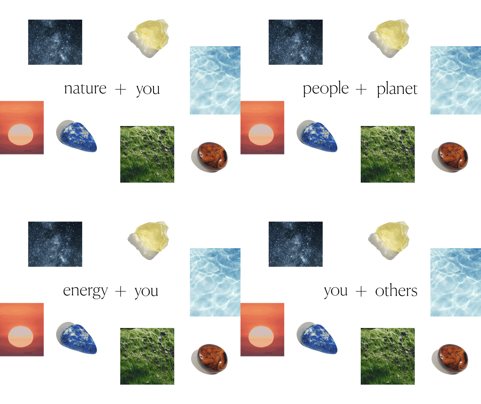
To differentiate ourselves, we aimed for a global, premium, and refined visual identity with clean, bold, and minimal lines. We looked to nature to provide contrast and warmth, through the use of organic textures and the colors of the stones themselves.


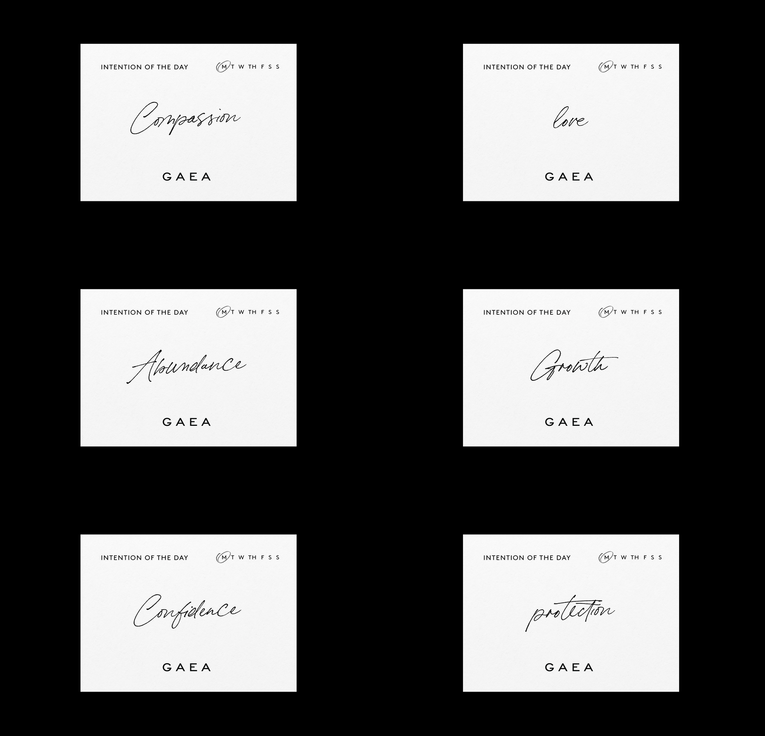
➂ BRAND IDENTITY DESIGNThe brand’s custom logo embodies the brand’s visual keywords of bold, minimal, and refined. Use of a sans-serif font that communicates luxury, quality, making use of negative space to express minimalism. The logo was designed to be legible at various sizes, with the alternate brand monogram to provide flexibility for various applications.
For the typography, we paired a modern serif font to work seamlessly with a bold sans-serif font, further communicating an elevated and refined visual aesthetic.
Our color palette was inspired by nature once again, and we looked to the jewel colors of Ruby, Emerald, Sapphire, and more to take centerstage.


➂ WEB DESIGN & DEVELOPMENTAs more and more customers turned to online shopping, the need for the brand to have an online catalog became a necessity.
The challenge was to find a way to unify this with the brand’s in-store sales, so we turned to Shopify to bridge this gap, designing a website that was both functional and beautiful for mobile and desktop. We also optimized the SEO ranking of the site, ensuring that each product contained the necessary meta tags to rank high on Google search results.
Optimizing the website for mobile-first shopping, we customized the user’s experience to feel as seamless as possible by tailoring the product menus and pages to cater to the ways customers intuitively shop.
➃ E-COMMERCE PHOTOGRAPHYPerhaps the most detailed aspect of building the website was the documentation of the brand’s catalog, which spans thousands of products. As photographers know, jewelry photography is one of the trickier disciplines, but I was more than up to the Herculean task.
The launch of the brand’s online store was a massive success, increasing their sales by more than 4000%.


FINAL THOUGHTSThis has been the most comprehensive and rewarding project of my creative career thus far for a number of reasons.
First of which, was that I was given a lot of room for creative exploration - as most creatives know, this can sometimes be even more challenging to navigate than working within constraints, but the creative freedom allowed me to explore, iterate, and to stay curious throughout the journey.
The biggest challenge of all was that this was a monumental project spanning multiple disciplines, while working as a design team of one. As someone who has always worked with a team in the past, to see a project of this scale from concept to execution as a solo creative gave me the incredible opportunity to really refine my skills in each of these areas.
Working with a huge team is a thrilling experience, but to work solo was an intensely rewarding experience and made me a better creative all around.
READY TO GET STARTED?